How Our New Landing Page Design Lead to a 250% Increase in Conversions
Even though I deal with landing pages almost daily, it still amazes me how powerful they are when done properly. Now granted you have to understand that properly can also vary from industry to industry and from product to product and each specific intention or end-goal. The key is to listen to what your visitors are telling you and how they are interacting with your page. For those who don’t yet know what a landing page is, I like to call it a simpler term; a “lead generation page.” A landing page is just broadly defined as the page that a visitor lands on, but more specifically a specially designed page that has one goal in mind; and that’s to convert a visitor into doing some sort of action. That action may be to purchase a product, sign up to a newsletter, contact a firm directly, submit a contact form and much more.
Webdigia offers landing page optimization as part of our internet marketing mix for our clients, but in this post I am going to talk about a case study that we have done as part of our own landing page re-design that lead to a 120% increase in overall actions on the page and a shocking 250% increase in conversions. If you want to know how we did it, make sure you stick around and keep reading.
Old

New

Although we had just launched our highly polished website maintenance landing page about 4 months prior, we soon realized that we were still missing something. We didn’t rush back to the drawing board, but rather looked at what we had and then dove into the data mines. Our landing page had everything we needed: visitor connections, appropriate and relate-able images, salescopy intertwined with heavy SEO copywriting, Q&A and the use of colors to instill both calming and urgency for action. While it was working as intended, we knew that we could do better. If I have learned one thing since entering this line of work, you can never get comfortable; there’s always somewhere or something you can improve on – whether it’s your landing page or another area of your website or even tweaking your services and promotions. Everything has to work in unison and provide the best funnel and experience possible for your current and potential customers.
After looking at the data, speaking with our customer service department, and admitting to ourselves what was needed, we decided that we needed to redesign our website maintenance landing page. Most of our original copy stayed, but the most significant part of the entire redesign is that we saw the need to break down the steps of how the service works in a ridiculously simple method. More on this later and why simpler meant more conversions.
I want you to read this post and realize how significant even the smallest changes can be with a landing page. Don’t take anything for granted. Something as simple as changing font size, providing arrows, a video guide or making a button larger and with a better call-to-action line of text can have profound effects on your visitors user experience, connections, trust and most importantly – conversion rates.
Getting Started
As I mentioned above, we really wanted to dig deep into understanding how our landing page was being used, where we were excelling and where we could improve. We knew that our landing page worked because we were receiving consistent email leads and calls but we soon realized what customers were repeatedly asking. Even though we said exactly what website maintenance was and what it would cover, we failed to explain how it worked (uncertainty for visitors is not ideal, even if you can explain it later). Our page was also a bit too “copy heavy” up top and it left the visitor scrolling and searching for information. Instead we wanted to present them with the information almost immediately rather than making them find it on their own.
This was especially evident after speaking with our customer service department and really picking their brains on what the most common questions were from new leads. With this information, we knew that we needed to break down our maintenance process in a simple and easy to understand way. We needed to build on our landing page expertise and really dial our approach in for our specific leads that needed website changes and other maintenance functions. The web can be stressful for others and more confusion on how the process works and how to get help simply was not going to be an option here.
Pre-Process – Review the data
How did we remedy our shortcomings? Well we brainstormed a few ways, and eventually decided that it would be done via graphics that were large, easily comprehended universally and alleviated any questions or uncertainties to how the process would work from start to finish. It wasn’t that simple though, we still needed to be focused on UX design and encouraging and understanding how a visitor was going to use the page. With the team armed with our thinking caps and creative thoughts flowing, all new aspects were combined in a “funnel” type fashion that walked the visitor through a series of stages as they viewed each part of the page. Believe it or not, every part of the page and its location has a specific purpose and job to do.
One part that is often hard and you may be able to relate to this, is how you can effectively combine a SEO copy-heavy page with sales copy. This is of course if you intend to rank this page organically for related keywords and not just use paid traffic. With major Google algorithms constantly being updated, thin pages are a thing of the past. You need content but you also need to present it in a way that is necessary, informative and enticing (don’t blabble on just to blabble on, it needs to have purpose too). I’ll be honest, not everyone is good at it and you may need to ensure that it is done by someone who knows what they are doing. The way we approached this was to focus most of our heavy SEO copy and why prospective clients should choose us towards the bottom of the page. This allows the information and optimized content to still be visible on the page for those who are the researcher types (the ones who need that extra nudge) and want to read every last character on the page and it also helps organic rankings. We then focused our large call-to-actions at the top but also slipped in SEO content within the enticing content to remain consistent throughout.
Design – Mixing function with aesthetics
The design of your landing page is especially important. I talked a little bit about this above, but I want to go into more detail here. For our website maintenance page we needed a design that could easily be scanned and have bits of information easily digested with little work or strain on the eyes. We did that with lots of whitespace and keeping the visitors focus centered on the page. Originally we used bullet points underneath large relevant titles and had an image that connected with the visitor at the top of our page but it was simply not the best approach for our specific needs. This approach has had profound effects elsewhere, but it was not solving our visitor’s consistent questions about how our service worked.
Our design needed to be illustrative, easy to understand and convey the process instantly. We decided to implement a 3-step illustration at the top of the page that is also reiterated again (additional reassurance) before our main CTA which is having the visitor purchase website maintenance blocks or sign up for a monthly subscription. Go ahead and open the website maintenance landing page in a new tab or take a look at the illustrations as we go along. Reading and then seeing the actual design or content on the page will help you retain and understand the information better.
Subconscious Techniques – Answer the underlying question
One of the most important objectives of a landing page is to hone in on the ability to tap into the visitor’s subconscious level. Yes, design and psychology play nice together! You can connect with someone even though they may or may not know it’s happening. Have you ever visited a website and just knew it was a spam infested waste of time? How about a website that spoke your lingo and its sense of community made you feel right at home? Well, this is one easy example however it goes much deeper than just winning a first impression and connecting with your target audience. You can also effectively tap into a users psyche and answer the questions that they have immediately thought of, and even the ones they may not have thought of, but still are eager to know. Anticipate and answer your leads questions.
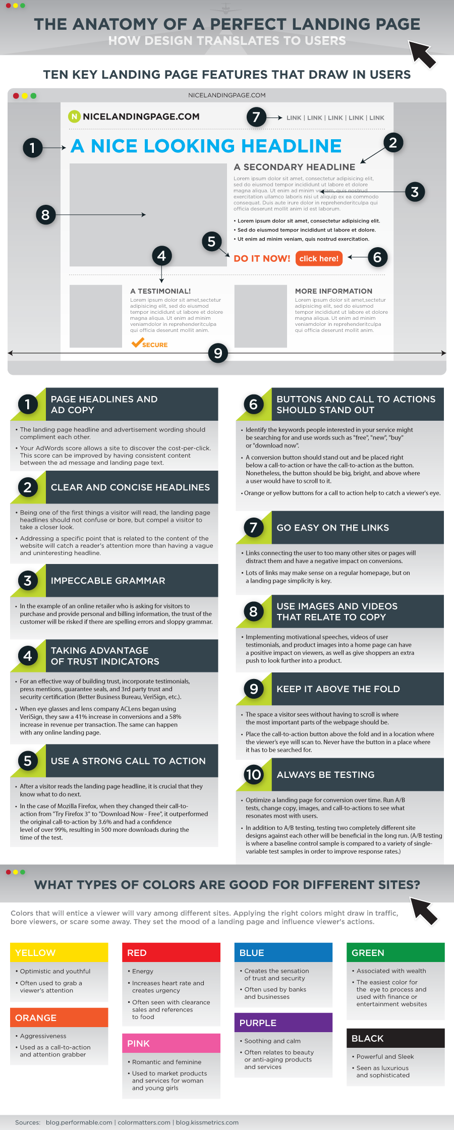
Credit for “The Anatomy of a perfect landing page” goes to Kissmetrics
I want to quickly revisit how speaking with our customer service team led us to answering our visitors questions. We had overlooked a question that we thought we could explain later, and one that seemed quite obvious. Okay you want website changes done, we’ll make it happen; but it was still too broad for our target audience -they wanted more. Through the use of the questions the customer service team usually receives, we were able to develop more concise and connecting headings and explanations that instantly made our leads feel more at ease.
Subconscious techniques are an excellent way to make a visitor feel a certain way (ie: excited), alleviate stress and concerns and it can be done in a number of different ways with both text and design. For our landing page, we decided to choose an excitement color (Orange) versus an authority color (Green) for use in our funnel. We already knew that our clients were feeling a bit lost, so we carried and built upon that by providing distinct and excitement inducing orange call-to-action buttons.
The Power of White Space – Controlling the visitors sight
If a landing page or website in general is too “busy” you are not going to be able to effectively captivate a visitor’s attention properly. Too many images, flashing banners and too much information packed into one space is a surefire way to cause confusion, lack of attention and loss of a lead. Whitespace can be used to create sections that divide into new experiences as one scrolls down a page. Remember the goal is to inform, instill trust and steer the visitor into a series of movements through the page. With optimal whitespace you should have approximately one section per scroll on most common screen sizes and displays with a slight intro into the next section of your landing page.
Whitespace also pairs amazingly with call to actions. With large open areas that aren’t cluttered you can effectively captivate interest and action without overwhelming or seeming pushy. A large orange button for example after some whitespace allows the mind to think about what comes next and then seeing the button encourages that action once the mind has settled and processed the decision as their own.
The Funnel Process – From visitor to client
The funnel process is your chance to walk the visitor through your landing page without giving explicit directions. We start from the top of the page all the way to the bottom catering to each type of consumer in our niche along the way. You’ll see CTA buttons in increments and lots of whitespace in our lead funnel process. Our first funnel end targets quick buyers who are ready to buy now and know exactly why they came to our page. Then the funnel reopens a little further down to target the buyers who may need some slight motivation. These buyers want to know what they’re getting, the features, pricing options and plans before hitting that buy now button.
After these relatively quick buyers we still have the late buyers or consumers who tend to be research heavy before making a purchase decision (they may even return later and not make a decision on the first visit). They want to know everything they’ve already read thus far but will likely continue reading through typical requests to make sure their requests are covered; they’ll want to know why we deserve their business and what we offer that stands out from the others in our industry. We cater to these types of leads in the final funnel section that is very copy heavy and leads to a call-to-action at the bottom.
Looking from top to bottom, our maintenance landing page goes from simple illustrations and descriptions to raw copy and data for additional reassurance and nudging. This content was originally focused on SEO but we found a way to use it effectively in our funnel process for the researchers.
The Results!
Okay, down to the full list of numbers. Well we reviewed our websites analytics and discovered some amazing increases over our previous layout and approach. I knew our leads had increased but the data painted a much nicer picture. Check them out below:
- 250% Increase in our conversion rate (that’s massive!)
- 120% Increase in overall actions
- 20% Increase in on-page time
Share